Several re-workings of the premise and few title changes down the line and Space: 1999 hit the ATV Midlands franchise of the ITV network on Thursday 4th September 1975. And I remember sitting down to watch it. And it was good.
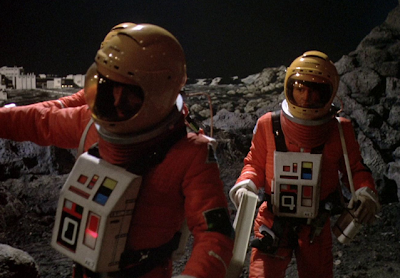
Like all of Anderson’s productions it had style coming out of every airlock, with ships, guns, communicators, corridors, costumes and even soft furnishing looking as sleek and futuristic as possible. And the space suits were pretty good as well. Though not by any stretch a classic design, they are perhaps just a little too practical to ever be considered cool or sexy, they never the less stand out if only for their oranges and lemons colour scheme. I suspect that lessons learnt about difficulty of movement, speed of dressing and overheating while filming for the moon scenes in UFO lead to a few of the more practical design and material choices being made here. And that’s understandable really because no one should suffer for other people’s art.
A second series went into production early in 1976 and although there were a few cast changes and even further sexing up the sci-fi’ness of the show, I can’t see that the suits were ever improved upon in any way.
From a personal point of view I was always rather taken with the chest units and the space age font with which they were numbered. I can see a Kubrick 2001 influence in their look which had passed me by until now. But that’s not a bad place to draw inspiration from after all they’re still doing it to this day.
Enjoy the rest of the pictures and know that there’s some really good finds on the way for May.
Steve


It seems as if the font for numbering the chest units changed between the first and second series. As usual, I find the first series more appealing.
ReplyDeleteI'm working through season one at a very leisurely pace. I may do season two but not certain yet.
DeleteI wonder what is the exact colour of these suits. In the pictures 2,4,6 and seven they look like brick red. In other pictures the colour is orange. It is very confusing. I am building the MPC Disposal Area 2 diorama and can´t decide what colour to use.
ReplyDeleteAlways seemed orange to me both back in the day and re-watching the DVD. Has to be covered somewhere on a FAnderson site, though, those guys seem all over the details.
Delete